

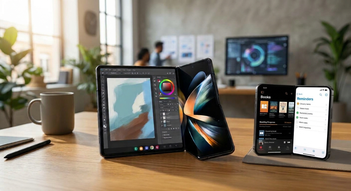
Folding Phones Change UI/UX
Folding phones are not just larger smartphones—they introduce a device whose screen size, shape, and physical posture change during use. That shift forces designers to move beyond static mobile layouts and create interfaces that adapt smoothly to folded, unfolded, and partially open states.
From one screen to many states
A conventional phone has one predictable viewport. A foldable may start as a compact cover screen, expand into a tablet-like canvas, then stand half-open in “Flex” mode for video calls, reading, or hands-free use. Android’s guidance specifically calls for adaptive layouts that work across these sizes, orientations, and postures.
The key UX principle is continuity: when someone unfolds the phone, the app should feel like the same experience, not a new app. Content, scroll position, and in-progress text should carry over seamlessly from the cover display to the main display.
Designing around the fold
The crease is both a physical and design constraint. Buttons, menus, and important text should avoid sitting directly on the fold, where they can be harder to read or tap.
Good foldable design also treats the hinge as a feature. In a half-open posture, an app can place content on the upper screen and controls on the lower screen—for example, a video call with participants above and call controls below.
More space, better multitasking
The larger unfolded display enables interfaces that a normal phone cannot support well:
- Two-pane layouts, such as an email list beside a message.
- Side-by-side editing, such as writing while viewing source material.
- Richer navigation, including navigation rails instead of cramped bottom bars.
- More useful multitasking, with apps and content visible at once.
But extra space should not simply mean stretched text and oversized buttons. Effective designs use responsive grids, sensible content widths, and layouts that add meaningful information rather than merely enlarging the same interface.
What good UX looks like
A strong foldable experience should feel:
- Continuous: The user’s place, input, and context survive the transition between screens.
- Adaptive: The layout changes intelligently with screen size and posture.
- Ergonomic: Controls remain reachable and readable in every folding state.
- Purposeful: The larger screen enables new interactions, rather than just displaying a stretched phone app.
The takeaway
Folding phones change UI/UX because the interface must respond not only to what users tap, but to how they hold, open, and position the device. The winners will be apps that make the fold feel invisible—while using the expanded canvas to make everyday tasks faster, clearer, and more capable.